Enchanting Blue: The Limitlessness in Emotive Power of Blue in Art, Literature, Music, and the World Around Us
By Mizuho Yoshimune
Designed by Mizuho Yoshimune, 2025.
How does a single color hold an enchanting effect on our senses? Colors have remarkable influence over our lives; they shape our emotional responses, our behaviors, and how we perceive the world around us — and within us. And yet, of all the color categories, one has a particularly magnetic and limitless effect: blue.
I recently came across “Why Are We So Obsessed With Blue?”, an essay in The New York Times Style Magazine by Amanda Fortini that coincidentally explores the fascination over this color especially among artists, musicians, and writers. In my daily life when I sit at the piano working on Schumann, Bach, Chopin, Scriabin etc., color goes beyond the visual and into the aural and realms of imagination — What is the color of this sound? The narrative? The character? The emotions? Is this the color of hope? Of unfulfilled longing? Or of impassioned bravura? We’re often faced repeatedly with the question, “What is the color of this passage?” — which, indirectly is asking what the underlying emotions are that we are trying to convey in the music, through the emotive associations of color.
But some colors are more multi-dimensional than others. Yellow, regardless of the shade, would likely evoke an uplifting emotion (joy, optimism, hope). Blue, however, is more elusive — it can capture both the tangible and the imagined, grounded reality and the magical, effervescent and the tranquil, melancholy and a strengthened resolve — and everything in between. (N.B. On the CSS gradient, yellow has five shades, whereas blue has an astonishing 134 shades, each slightly different from one another and suggesting a nuanced emotional effect.)
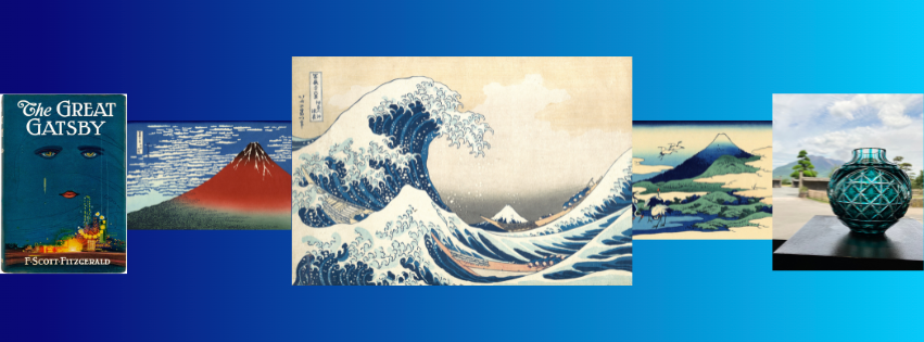
The original, and most widely-used, 1925 cover of The Great Gatsby by F. Scott Fitzgerald is arguably one of the most recognizable covers in American literature, which uses Spanish artist Francis Cugat’s Celestial Eyes (1924).
A striking representation of the literary classic, the particularly forlorn shade of blue in Celestial Eyes captures the disillusionment of the American Dream and the moral decay of the 1920s amid the impression of opulence. It is not very often that the cover art of a book is so deeply intertwined with the plot, that the image alone captures the unspoken emotions and moral message of the novel beyond what words can convey.
And yet, not all shades of blue portray melancholy. On the opposite end, many times shades of blue can evoke great vitality, nobleness, and tenacity. Prussian blue in particular became a popular medium in 18th-19th century Japan, and especially in the ukiyo-e woodblock prints showcasing the everyday life, landscapes, travel scenes, and kabuki actors. Most notable were the prints of Ando Hiroshige (1797-1858) and Katsushika Hokusai (1760-1849), two towering figures of ukiyo-e, and for whom the Prussian blue hue was a source of a distinctly vibrant and brilliant blue.

Andō Hiroshige, Nihonbashi: Clearing after Snow (日本橋雪晴) from “One Hundred Famous Views of Edo,” 1856.
Nihonbashi: Clearing after Snow is the first print in Hiroshige’s One Hundred Famous Views of Edo, a series of 119 ukiyo-e prints depicting Japan through the eyes of everyday people in 19th century Edo. A snow-capped Mount Fuji stands in the distance as the snow clears in the streets of Edo, and the royal blue evokes a feeling of return to life and vitality as the winter melts and gives way to bustling activity of the urban people.

Katsushika Hokusai, Under the Wave off Kanagawa (神奈川沖浪裏), 1831, Woodblock print; ink and color on paper.
Hokusai, Fine Wind, Clear Morning (凱風快晴), c.1830-1832, Woodblock print; ink and color on paper.
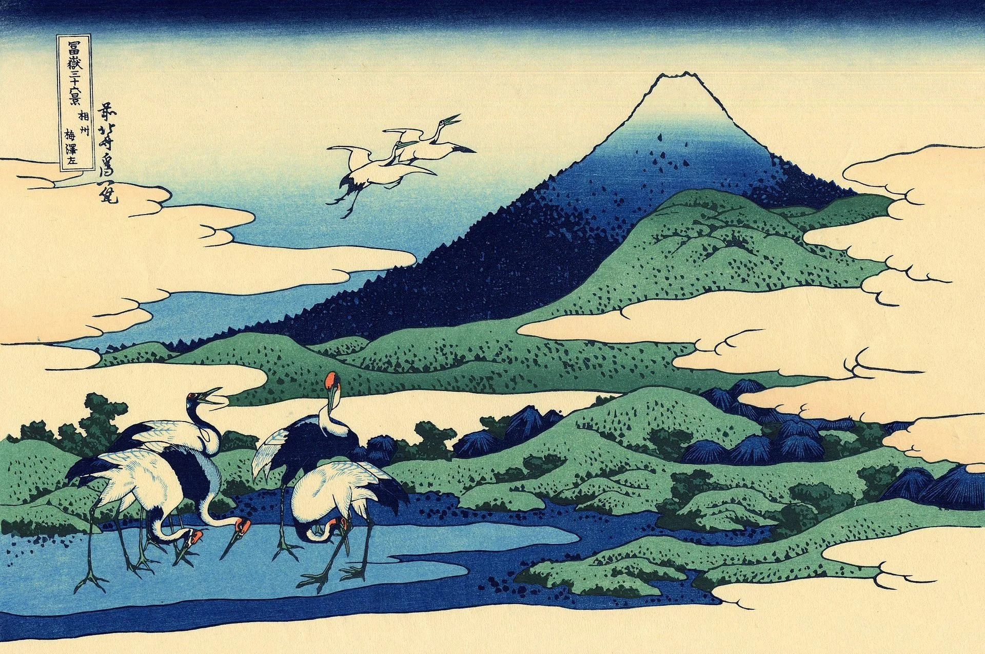
Hokusai, Umezawa in Sagami Province (相州梅沢左), c.1830-1832, Woodblock print; ink and color on paper.
Hokusai’s Under the Wave off Kanagawa (or “The Great Wave”) is one of the most recognizable works of Japanese art and was also the first print of his “Thirty-six Views of Mount Fuji” landscape series. The unpredictability, beauty, and unrestrained power of the great waves are palpable — and all expressed mostly within the singular spectrum of blue in various degrees. The fiery red Mt. Fuji in Fine Wind, Clear Morning (or “Red Fuji”) has its captivating appeal partially from the particular hue of blue behind it, which uses the Berlin indigo, or bero-ai. The blue backdrop of reliable clarity and depth helps to elevate the red Mt. Fuji to its near-spiritual splendor. In contrast, the same Mt. Fuji becomes a seamlessly rich blue gradient in Umezawa in Sagami Province, as cranes peacefully drink from the blue water, while two take flight towards Mt. Fuji. Here, the blue suggests the serenity of time suspended as nature remains undisturbed by human interaction. Even centuries later today, these timeless ukiyo-e prints are astonishing feats of the focus on a singular color and the emotive nuances within blue alone, capable of expressing both the visible and the intangible.
Returning to music, one of the most prominent references to blue as well as the dramatic emotive powers of this enigmatic color is in Scriabin’s Sonata No.2 in g-sharp minor, Op.19. Deeply inspired by his travels to the Baltic coast, the colors of the ocean became the central influence of this work, so much so that Scriabin included his own notes on the second sonata upon its publication in 1898, in which he described the work as:
“Everything glowed with magnificent majesty on the horizon. First a clear purple, then it turned rose-colored, and finally silvery flecks stained the surface of the sea…. The green of the sea blended with the blue reflection of the sky. There was such a play of colors and shades as I've never seen. It was a picture, a triumph of colors, a festival of truth.”
“…the first movement represents the quiet of a southern night on the seashore; the development is the dark agitations of the deep, deep sea. The E-major middle section shows caressing moonlight coming after the first darkness of the night. The second movement, Presto, represents the vast expanse of ocean stormily agitated.”
Scriabin would later develop the clavier à lumières for his 1910 composition, Prometheus: Poem of Fire, in which the key of E Major would be indicated as a cool, sky-blue color.
In my mind, I imagine the entirety of the sonata to be set at nighttime, traversing the ocean from its gentle shores and scintillating waves, to the ferocious and unfathomable depths of the sea. A synesthetic composer particularly sensitive to color and thus the emotive associations that came with them, associating clear imagery of color and scenery in Scriabin was frequently on my mind when I worked on the piece a few years ago.
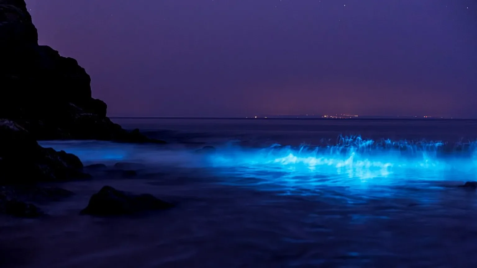
And yet blue in this context called for an entirely different approach and expression compared to the ukiyo-e of Hiroshige and Hokusai. In Scriabin, the blue shimmers, sparkles, weaves in and out of our consciousness, and transforms into the dark sea where it soars with the agitated waves. Thinking of an image to associate with the emotions expressed in the music can vary in ease and clarity depending on the piece, but for the sky-blue of the E Major middle-section it was a surprisingly natural and instinctive choice: the imagery of bioluminescent planktons (also called “northern lights of the ocean”) that turn a fluorescent blue, like a sea of stars that move with the waves in the ocean. A stunningly beautiful natural phenomenon, these bioluminescent planktons can be seen along particular coastlines including those of Southeast Asia, Maldives, and Puerto Rico, where they shimmer with an otherworldly effect.
Combined with the luscious harmonies, imagined sounds of the sparkling blue waves washing ashore, and some of the most beautiful melodies ever written — is there a more magical and beautiful evocation than this?
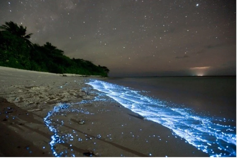
Source: Sea of Stars, Doug Perrine, March 19, 2012, National Geographic.
Source: Thomas Winstone, June 25, 2023, BBC News.
The magical and lingering effects of the glittering blue in the first movement of the Sonata then transforms into an ominous shade of the agitated sea — past midnight blue, and nearing onyx as the shades of blue morph rapidly with the molto perpetuo rhythm of the restless waves. Here we have nature and the sea at its most fearsome, yet noble in its unapologetic demeanor.
How did we get from the tranquil, happily-nostalgic, and sparkling evocations of the color blue in the first movement, to the stormy, foreboding, and powerful depiction of the same color in the final three minutes? No other color has the same duality, or rather, the limitless possibilities of emotive expression than does blue.

Stepping closer to present day, blue was also noticeably one of the most stunning colors I noticed on my trip to Japan last summer. One of the most striking impressions was the Satsuma kiriko glassworks in Kagoshima that uses the gradation effect developed in the 19th-century by the Satsuma clan and is still continued to this day — a mesmerizing display of craftsmanship and the beauty of color. Along with it, etched in my memory is always the timeless, beautiful paradise of Tanegashima, Japan.
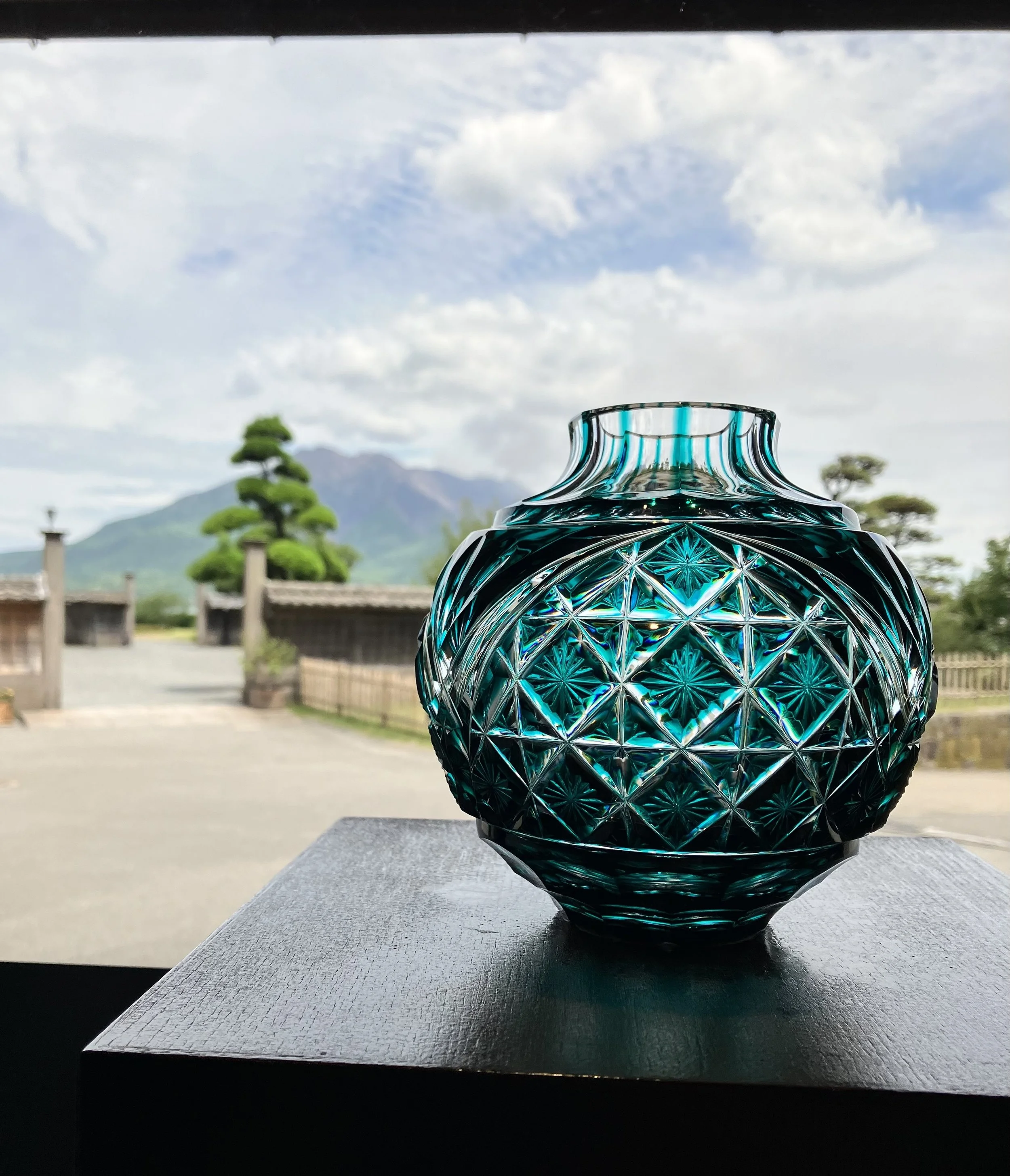
Satsuma kiriko glasswork, photo taken June 2024 in Sengan-en, Kagoshima.

Tanegashima, Japan, photo taken June 2024.